

2000s YA Cover Changes
What do you think of some noteworthy 2000s YA Cover Changes? Love these new 2010s YA Book Covers? Hate them? Indifferent? Let’s discuss!
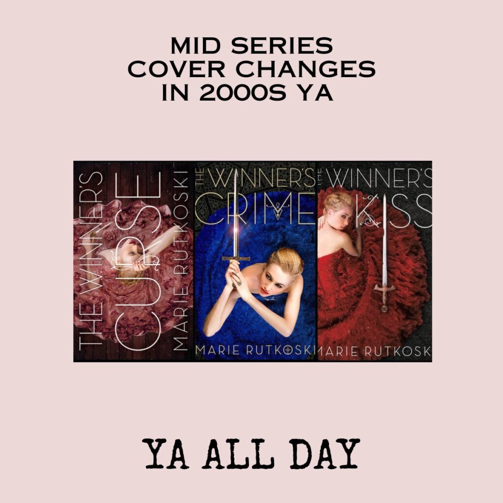
Today I thought we could discuss something that causes great wringing of hands and gnashing of teeth among bloggers: the mid-series cover change.
I’m very suspicious of cover changes. In general, it seems to me that most cover changes take a very unique, particular cover and replace it with a WAY more generic and forgettable cover. But maybe that’s just me.


You may have seen the new covers, but if not, here they are:


Publishing is a business and sales are the goal. In a way-back-from-2009 blog post, Sarah Rees Brennan talked about the whys of cover changes. Her bottom-line conclusion is that cover changes are an attempt to increase sales. Sometimes covers are changed to improve a cover that’s disliked, and other times they are changed to appeal to a different audience.
I guess that second thing is what’s happening here. I prefer the old covers. I think they better reflect the fact that Kestrel, the main character, is more the wear-a-ballgown-and-fight-with-her-wits kind of girl than the sword-brandishing-assassin kind of girl. I’m sad that the beautiful red dress cover that was revealed with huge fanfare back in May

has been replaced by this new cover

This third cover is my least favorite. And it’s a little weird to me that a book with a title like “The Winner’s Kiss” was matched with a cover that shows a girl in a tunic standing in front of an explosion like some female sidekick in an adventure movie. A character that, with her side-braid and post-apocalyptic outfit, looks like a combination of Katniss and Clarke.
I prefer the old covers. But then, I’m probably not part of the new demographic that the new cover is trying to appeal to. If you haven’t read these books, you should — they are well-written and smart. I will absolutely read the final book but I may have to take the dust jacket off beforehand and hide it under the couch cushions…


