YA Book Covers Featuring Torn Paper Effects
Welcome to another installment of Trending Thursday, a periodic blog feature that looks at various YA trends.
Today I’m going to re-visit a couple of enduring trends … because you know that everything old is new again…
What does this Harper’s Bazaar cover shoot have to do with cover trends?

It’s similar to a book cover trend that I talked about back in March!
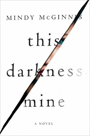
The torn cover trend continues, and there’s another upcoming title that features it:
Which also drips on with a brand new summer of 2017 title:
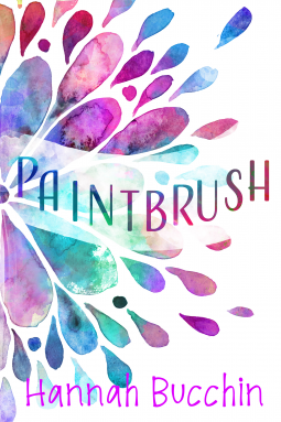
Speaking of color, way back in spring 2015 I talked about the prevalence of day-glo bright covers. Summer 2017 has brought a slew of summery pastel covers, though the colors have (thankfully) been toned down just a touch:
What are your thoughts about these?


Not a fan of the ripped paper covers. I did like the tear drop ones at first but they are SO similar that I can't tell the books apart anymore and don't even bother to see what they are about.
The day-glo?? Depends. It can still be cute, especially for summer.
For What It's Worth
Not a huge fan of the ripped covers but I am digging the way they did the title placement for The Man Who Hated Women.
What a fun post! I do like how some of the ripped covers have a little extra on some of the covers these days. I saw one at the bookstore where I work that had an eye peeking out of the rip and it looked very 3D.
This is such a fun post, I love the ripped cover and rainbow raindrop trends! 🙂